Move repeated color decisions into named roles, keep each surface paired with its foreground, and test the rendered result in both themes. With Tailwind CSS v4 and PyColors, the token package already provides the bridge from those roles to utilities such as bg-primary and text-primary-foreground.
That last pairing matters. This walkthrough builds a small project settings card, migrates it, then deliberately leaves text-white on the primary button. The light version looks fine. The dark version exposes the mistake. Removing that override restores the foreground chosen for the dark surface.
Everything below runs in an independent Next.js consumer using public npm packages. The example stores a name in React state and displays a local confirmation; it has no server, account, or persistence integration. The screenshots show this experiment, not a deployed product.
Start with one decision that repeats
The before card has a title, a named input, a status message, and a save action. Its button owns both theme palettes:
<button className="bg-[#065f46] text-white dark:bg-[#6ee7b7] dark:text-[#052e16]">
  Save changes
</button>
The input repeats those greens for focus. The card and field each repeat a light and dark surface. This is manageable for one screen, but changing the brand means finding every place that made the same decision.
#065f46 is a concrete color value. primary is a role: the surface used for the primary action. primary-foreground is the text that belongs on that surface. The role stays stable when its value changes between themes.
| Decision in this example | Role consumed by the interface |
|---|---|
| Page surface and text | background / foreground |
| Settings card and its text | card / card-foreground |
| Save action and its label | primary / primary-foreground |
| Input outline and focus | input / ring |
| Supporting status text | muted-foreground |
These are existing roles, not a new naming system. See the token overview for the broader contract.
Reproduce the experiment outside a workspace
Create an empty directory outside any monorepo. Use Node 24.18.1 and pnpm 10.32.1 to match the tested environment. Save the following six files at the indicated paths; create the app directory first.
The direct dependencies are pinned to the versions actually installed for this experiment: UI 1.5.4, Tokens 1.2.3, Next.js 16.1.1, React/React DOM 19.2.0, and Tailwind/PostCSS plugin 4.3.3. These are a reproducible test baseline, not a recommendation to hold a production application on these versions indefinitely. A fresh install resolves transitive dependencies; keep the generated lockfile for subsequent runs.
The public manifests expose the UI root entry point and the token stylesheet. UI declares React and React DOM >=18; its optional lucide-react peer is also pinned below. Next.js 16.1.1 accepts this React pair and requires Node >=20.9.0.
{
  "name": "semantic-token-lab",
  "private": true,
  "version": "0.0.0",
  "packageManager": "pnpm@10.32.1",
  "scripts": {
    "dev": "next dev",
    "build": "next build",
    "start": "next start",
    "typecheck": "tsc --noEmit"
  },
  "dependencies": {
    "@pycolors/tokens": "1.2.3",
    "@pycolors/ui": "1.5.4",
    "lucide-react": "1.47.0",
    "next": "16.1.1",
    "react": "19.2.0",
    "react-dom": "19.2.0"
  },
  "devDependencies": {
    "@tailwindcss/postcss": "4.3.3",
    "@types/node": "24.12.0",
    "@types/react": "19.2.2",
    "postcss": "8.5.28",
    "tailwindcss": "4.3.3",
    "typescript": "5.9.3"
  }
}export default {
plugins: { "@tailwindcss/postcss": {} },
};This uses the official Tailwind v4 Next.js integration: the PostCSS plugin processes the CSS import.
{
  "compilerOptions": {
    "target": "ES2017",
    "lib": ["dom", "dom.iterable", "esnext"],
    "allowJs": true,
    "skipLibCheck": true,
    "strict": true,
    "noEmit": true,
    "incremental": true,
    "module": "esnext",
    "esModuleInterop": true,
    "moduleResolution": "bundler",
    "resolveJsonModule": true,
    "isolatedModules": true,
    "jsx": "react-jsx",
    "plugins": [
      {
        "name": "next"
      }
    ]
  },
  "include": [
    "next-env.d.ts",
    ".next/types/**/*.ts",
    ".next/dev/types/**/*.ts",
    "**/*.mts",
    "**/*.ts",
    "**/*.tsx"
  ],
  "exclude": ["node_modules"]
}
Next.js generates next-env.d.ts when you run the application. The root layout imports the stylesheet once and supplies the required HTML and body elements.
import type { ReactNode } from "react";
import "./globals.css";

export default function RootLayout({ children }: { children: ReactNode }) {
  return (
    <html lang="en">
      <body>{children}</body>
    </html>
  );
}
Keep the existing token bridge
@import "tailwindcss";
@import "@pycolors/tokens/tokens.css";

@source '../node_modules/@pycolors/ui/dist';
@custom-variant dark (&:where(.dark, .dark *));

:root {
  --primary: #065f46;
  --primary-foreground: #ffffff;
  --ring: #065f46;
}

.dark {
  --primary: #6ee7b7;
  --primary-foreground: #052e16;
  --ring: #6ee7b7;
}
The public token stylesheet supplies :root defaults, .dark values, and an @theme inline bridge. For example, it maps --color-primary to var(--primary). Tailwind's inline theme option makes the utility use the referenced value. We override the existing roles; we do not copy the bridge or create another one.
In the inspected Tokens 1.2.3 artifact, these role declarations are unlayered. The matching :root and .dark overrides above follow the imports at the same specificity, so later declarations win for those selectors. “Put it last” is not a general cascade fix: introducing layers, more specific selectors, or differently scoped variables can change the result.
Two separate mechanisms are needed here:
@sourceexplicitly scans the installed UI distribution. Tailwind does not scannode_modulesby default. This path is relative toapp/globals.css; adjust it if your stylesheet lives elsewhere.@custom-variant darkmakes the before card'sdark:*utilities follow the same.darkwrapper as the semantic variables. This follows Tailwind's manual dark-mode selector.
The wrapper switch is deliberately local to the experiment. It does not persist a theme preference or implement system-theme detection. For application-wide integration, use the canonical UI theming guide.
Run all three versions on the same screen
This client page needs state and click handlers, hence the Next.js use client boundary. The root layout remains a Server Component. React's useState holds the same name and confirmation for all three versions.
"use client";

import { useState } from "react";
import { Button, Card, Input } from "@pycolors/ui";

type Version = "before" | "broken" | "after";

export default function Page() {
  const [dark, setDark] = useState(false);
  const [version, setVersion] = useState<Version>("before");
  const [name, setName] = useState("Field notes");
  const [saved, setSaved] = useState(false);
  const updateName = (value: string) => {
    setName(value);
    setSaved(false);
  };
  const disabled = !name.trim();
  const status = saved ? "Saved locally." : "No server request is sent.";

  return (
    <div className={dark ? "dark" : ""}>
      <main className="min-h-screen bg-background p-4 text-foreground">
        <div className="mx-auto max-w-md space-y-6">
          <h1 className="text-2xl font-semibold">Semantic token lab</h1>
          <div
            className="flex flex-wrap gap-2"
            role="group"
            aria-label="Experiment controls"
          >
            <Button
              variant="outline"
              aria-pressed={dark}
              onClick={() => setDark(!dark)}
            >
              Dark mode
            </Button>
            {(["before", "broken", "after"] as const).map((item) => (
              <Button
                key={item}
                variant="outline"
                aria-pressed={version === item}
                onClick={() => setVersion(item)}
              >
                {item}
              </Button>
            ))}
          </div>

          {version === "before" ? (
            <section className="space-y-4 rounded-lg border border-[#e2e8f0] bg-[#ffffff] p-4 text-[#0f172a] dark:border-[#334155] dark:bg-[#0f172a] dark:text-[#f8fafc]">
              <h2 className="text-lg font-semibold">Project settings</h2>
              <label
                className="block text-sm font-medium"
                htmlFor="project-name"
              >
                Project name
              </label>
              <input
                id="project-name"
                value={name}
                onChange={(event) => updateName(event.target.value)}
                className="w-full rounded-md border border-[#94a3b8] bg-[#ffffff] px-3 py-2 text-[#0f172a] outline-none focus-visible:ring-2 focus-visible:ring-[#065f46] dark:bg-[#0f172a] dark:text-[#f8fafc] dark:focus-visible:ring-[#6ee7b7]"
              />
              <button
                id="save"
                disabled={disabled}
                onClick={() => setSaved(true)}
                className="rounded-md bg-[#065f46] px-4 py-2 text-sm text-white outline-none hover:bg-[#064e3b] focus-visible:ring-2 focus-visible:ring-[#065f46] focus-visible:ring-offset-2 disabled:opacity-50 dark:bg-[#6ee7b7] dark:text-[#052e16] dark:hover:bg-[#34d399] dark:focus-visible:ring-[#6ee7b7] dark:focus-visible:ring-offset-[#0f172a]"
              >
                Save changes
              </button>
              <p role="status" className="text-sm">
                {status}
              </p>
            </section>
          ) : (
            <Card className="space-y-4 p-4">
              <h2 className="text-lg font-semibold">Project settings</h2>
              <Input
                id="project-name"
                label="Project name"
                value={name}
                onChange={(event) => updateName(event.target.value)}
                style={{ minWidth: 0 }}
              />
              <Button
                id="save"
                disabled={disabled}
                onClick={() => setSaved(true)}
                className={version === "broken" ? "text-white" : undefined}
              >
                Save changes
              </Button>
              <p role="status" className="text-sm text-muted-foreground">
                {status}
              </p>
            </Card>
          )}
        </div>
      </main>
    </div>
  );
}
The after branch changes composition and color ownership, while retaining the named field, empty-name guard, and local save behavior. Card, Input, and Button come from the public package entry point. Layout utilities remain local. The input's minWidth: 0 lets its native field shrink within the narrow preview.
Install, build, and run:
pnpm install --registry https://registry.npmjs.org
pnpm build
pnpm typecheck
pnpm start --hostname 127.0.0.1 --port 3616
Open http://127.0.0.1:3616. Select before, broken, or after and toggle Dark mode. Edit the field with the keyboard, clear it to disable saving, and enter a name to enable it again. Reloading resets the local state.
Diagnose the failure in the rendered button
Select broken and enable Dark mode. The surface becomes mint, but the label stays white:
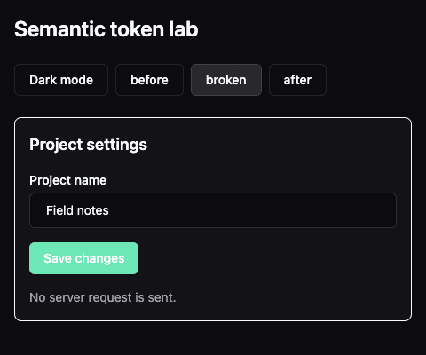
Real consumer capture, 480 × 400 CSS pixels. The intentionally retained text-white makes the label difficult to distinguish from the button surface.
The mistake is this caller override:
<Button className="text-white">Save changes</Button>Inspection of the installed UI 1.5.4 button and the rendered DOM showed the exact cause: the component's default variant supplies bg-primary text-primary-foreground, but its class merger lets the caller's text-color utility replace text-primary-foreground. In broken, the DOM contains text-white and no longer contains text-primary-foreground.
The CSS variables are correct. Reordering their declarations cannot repair a utility that no longer references them. Remove the text-color override:
<Button>Save changes</Button>Select after in the complete example to apply that correction:
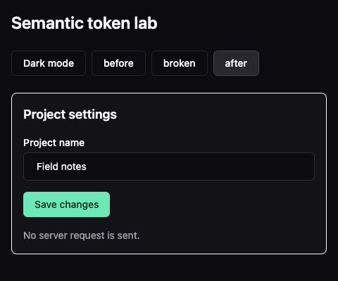
Same consumer, viewport, theme, and content. The button now consumes the matching primary-foreground role.
In DevTools, inspect #save after the color transition finishes. These were the computed colors and the resulting relative-luminance contrast ratios for the enabled, unhovered button:
| State | Text | Surface | Measured contrast |
|---|---|---|---|
| Broken, light | #ffffff | #065f46 | 7.68:1 |
| Broken, dark | #ffffff | #6ee7b7 | 1.52:1 |
| Corrected, light | #ffffff | #065f46 | 7.68:1 |
| Corrected, dark | #052e16 | #6ee7b7 | 9.78:1 |
Those measurements describe this pair in this state. They do not certify the entire interface, its focus indicator, hover colors, or disabled controls. Opacity, backgrounds, and custom palettes require their own checks.
Check behavior as well as colors
The isolated consumer passed a production build and strict TypeScript checking. Browser verification covered light and dark rendering, visible keyboard focus on the input and save button, Enter activation, the local status update, and disabling the button after clearing the field. The narrow preview was also checked for page-level overflow.
Repeat the checks when adapting it:
- Switch between before and after in each theme. Confirm that name editing and the local confirmation still behave the same way.
- Tab into the named field and then the save button. Look at the actual focus indicator against the current surface; a
ringclass alone is not proof that it is visible. - Clear the field, including whitespace-only input. Confirm that saving is disabled; type a name and activate Save with Enter.
- Inspect the enabled button at rest and on hover. Its hover treatment changes surface opacity, so do not reuse the resting contrast number blindly.
- Toggle broken in dark mode, confirm the white foreground, then select after and confirm the matching foreground returns.
- Check your own small and large viewports. Long labels, translations, and additional controls need another layout pass.
Keep the abstraction proportionate
Semantic roles centralize a decision; they do not decide whether the palette is good. A token can still contain an unsuitable value, and a caller can still override the intended pair, as this experiment demonstrates.
Tokens also do not remove every dark: utility. A theme-specific illustration, shadow, or layout treatment can legitimately remain conditional. Nor does one decorative color used once necessarily need a new role. Start with decisions shared across real surfaces and controls, then expand when another concrete use needs them.
Try your own brand color
Use the same loop with your palette: choose a primary surface, inspect its paired foreground in both modes, then check focus and interaction states in your application.
Try the Theme Builder to enter a brand color, inspect light and dark previews, and copy the generated CSS overrides. Place those overrides after the public token stylesheet import using the supported cascade described above, then rerun the checks. The builder helps explore the values; your rendered interface is where the result must be verified.